EQ-5D Analysis
Edwin van Leeuwen
Source:vignettes/articles/example_analysis.Rmd
example_analysis.Rmd
Article under active
development and subject to change.
Overview
This article will show a way to analyse longitudinal EQ-5D data using
statistical models and functionality from the qalytools package. The
goal is to calculate the utility values, identify explanatory variables
and calculate the QALY loss. It builds upon the introductory vignette
(vignette("example_analysis", package = "qalytools")) and
again utilises the synthetic EQ-5D-5L data contained within the
package.
A simple model
The survey includes the age of the participants. For the analysis we group the participants by age (\([20,40), [40,60), [60,+)\)). This is common practice in this field, because health outcomes are generally highly dependent on the age of the participants.
dat <- dplyr::mutate(
    qalytools::EQ5D5L_surveys,
    AgeGroup =  cut(age, c(20, 40, 60, Inf), right = FALSE)
)
Next we calculate the utility values using the value the NICE Decision Support Unit (DSU) value set. This maps between 5L and 3L whilst also accounting for the sex and age of respondents.
input_dat <-
    dat |>
    qalytools::as_eq5d5l(
        mobility = "mobility",
        self_care = "self_care",
        usual = "usual",
        pain = "pain",
        anxiety = "anxiety",
        respondentID = "respondentID",
        surveyID = "surveyID",
        vas = "vas"
    ) |>
    qalytools::add_utility(type = "DSU", country = "UK", age = "age", sex = "sex")
We will be using a mixed effect model to fit the utility values. The model is defined as:
value ~ (1 + acute | respondentID) + surveyID + sex + AgeGroup + sex:AgeGroupThis means that we assume each respondent to have a random effect as well as a random interaction between the first survey after symptoms (acute). Other explanatory variables are the survey, sex and age group (and the interaction between sex and age group). This model was chosen based on our knowledge of the data. For your own dataset it is recommended to choose your own model. For example, by exploring multiple models and choosing the best model (using standard model comparison methods).
To fit our mixed effect model we use the lme4 package.
While the utility value is truncated at 1, it has been shown that
assuming a normal distribution and performing a non parametric bootstrap
is a valid simplification (Pullenayegum et al.
2010 Jun-Jul).
# Label the acute period of the disease
dat <- dplyr::mutate(input_dat, acute = surveyID == "survey02")

# Define the model
model <- .value ~ (1 + acute | respondentID) + surveyID + sex + AgeGroup + sex:AgeGroup
fit2 <- lme4::lmer(model, data = dat)

# Compare predictions to the actual value
plot_dat <-
    dat |>
    dplyr::mutate(Model = predict(fit2)) |>
    dplyr::rename(Actual = .value) |>
    tidyr::pivot_longer(c(Actual, Model), names_to = "type", values_to = "value")

ggplot(plot_dat) +
    geom_line(
        aes(x = surveyID, y = value, group = respondentID, colour = sex),
        alpha = 0.1
    ) +
    theme_bw() +
    theme(axis.text.x = element_text(angle = 45, vjust = 1, hjust = 1)) +
    ylab("Utility value") +
    facet_grid(. ~ type)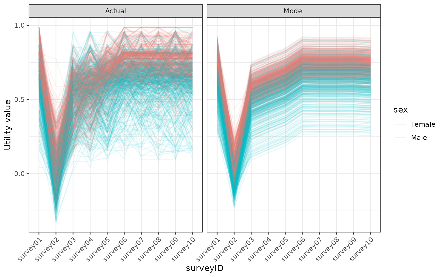
Comparing the modelled utility values with the utility values in the model. Utility values were calculated from a EQ5D5L survey using the DSU method.
We will use a non parametric bootstrap to calculate the uncertainty in our model. For this bootstrap we resample (with replacement) from our respondents and fit the model to the resampled data.
set.seed(1)
# Using 100 samples for illustrative purposes.
# For full analysis you should use >1000
nboot <- 100
respondents_dat <- dplyr::distinct(dat, respondentID)
models <-
seq(1, nboot) |>
purrr::map(
purrr::quietly(function(np_id) {
# Sample the respondents to include in this bootstrap and give them
# a unique id (boot_respondent_id)
boot_dat <-
respondents_dat |>
dplyr::sample_n(nboot, replace = TRUE) |>
dplyr::mutate(boot_respondent_id = dplyr::row_number()) |>
dplyr::left_join(dat, by = "respondentID", relationship = "many-to-many")
fit <- lme4::lmer(
.value ~ (1 + acute | boot_respondent_id) + surveyID + sex + AgeGroup + sex:AgeGroup,
data = boot_dat
)
list(model = fit, np = as.numeric(np_id), data = boot_dat)
})
) |>
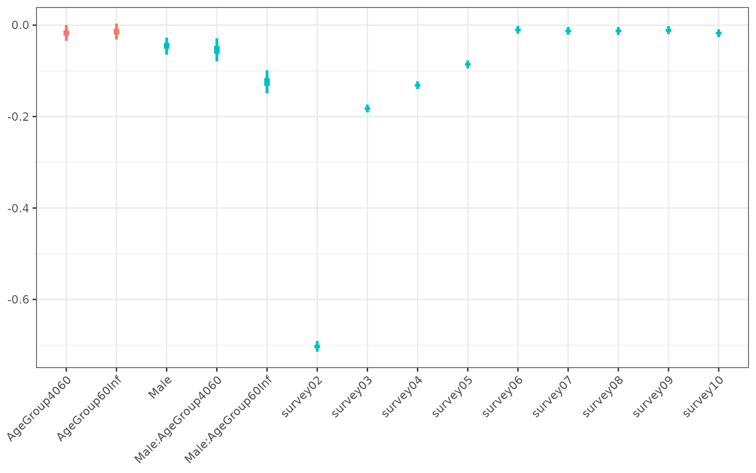
purrr::keep(function(lst0) length(lst0$warnings) == 0)Using the bootstrapped models we can capture the uncertainty in the coefficients of our explanatory variables (see figure below). Unsurprisingly, this shows that survey 2 is associated with the lowest utility value. Survey 3, 4 and 5 also had significantly worse outcomes than survey 1, but respondents returned to base line levels of utility from survey 6 onwards. We did not find a significant correlation between age and sex with their utility values, except for 60 and over year old males, who experienced lower utility than the other groups.
# Gather coefficients from the bootstrapped models
coeff_dat <-
    models |>
    purrr::imap(function(model, np_id) {
        summary(model$result$model)$coefficients |>
            dplyr::as_tibble(rownames = "id") |>
            dplyr::mutate(np = np_id)
    }) |>
    dplyr::bind_rows()

plot_dat <-
    coeff_dat |>
    dplyr::reframe(
        quant = c(0.025, 0.25, 0.5, 0.75, 0.975),
        value = quantile(Estimate, quant),
        Significant = all(value < 0) || all(value > 0),
        .by = "id"
    ) |>
    tidyr::pivot_wider(names_from = quant, values_from = value) |>
    # Cleanup names of the coefficients
    dplyr::mutate(idname = sub("sex|surveyID", "", id)) |>
    dplyr::filter(idname != "(Intercept)")

ggplot(data = plot_dat) +
    geom_linerange(
        aes(x = idname, ymin = `0.025`, ymax = `0.975`, colour = Significant),
        linewidth = 1
    ) +
    geom_linerange(
        aes(x = idname, ymin = `0.25`, ymax = `0.75`, colour = Significant),
        linewidth = 2
    ) +
    theme_bw() +
    theme(
        axis.text.x = element_text(angle = 45, vjust = 1, hjust = 1),
        axis.title.x = element_blank(),
        legend.position = "none"
    )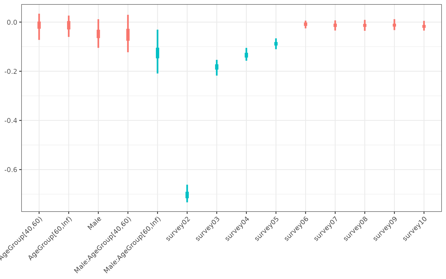
Coefficients of the statistical model. Uncertainty was captured by fitting the model to bootstrapped data. The blue colour highlights coefficients that were significant.
Finally, we use the model to generate utility values and calculate the QALY loss by age group. QALY loss compared to full health does increase with age, but when compared to the baseline health (survey 1) it stayed relatively stable.
# Calculate the QALY values for the different bootstrapped models
qaly_dat <-
    models |>
    purrr::imap(function(lst0, np_id) {
        lst0$result$data |>
            dplyr::mutate(pvalue = predict(lst0$result$model)) |>
            # Convert to utility
            qalytools::as_utility(
                respondentID = "boot_respondent_id",
                surveyID = "surveyID",
                country = ".utility_country",
                type = ".utility_type",
                value = "pvalue"
            ) |>
            # Calculate the qaly for based on the utility values
            qalytools::calculate_qalys(
                baseline_survey = "survey01",
                time_index = "time_index"
            ) |>
            dplyr::mutate(np = as.numeric(np_id)) |>
            dplyr::left_join(
                dplyr::distinct(lst0$result$data, boot_respondent_id, AgeGroup, sex),
                by = "boot_respondent_id"
            )
    }) |>
    dplyr::bind_rows()
plot_dat <-
    qaly_dat |>
    dplyr::summarise(value = mean(.value), .by = c(".qaly", "AgeGroup", "np")) |>
    dplyr::reframe(
        quant = c(0.025, 0.25, 0.5, 0.75, 0.975),
        value = quantile(value, quant),
        .by = c(".qaly", "AgeGroup")
    ) |>
    tidyr::pivot_wider(names_from = quant, values_from = value) |>
    dplyr::filter(.qaly != "raw")

# Include qalys calculated from the raw data
dat0 <-
    input_dat |>
    qalytools::calculate_qalys(
        baseline_survey = "survey01",
        time_index = "time_index"
    ) |>
    dplyr::filter(.qaly != "raw") |>
    dplyr::left_join(
        dplyr::distinct(dat, respondentID, AgeGroup, sex),
        by = dplyr::join_by(respondentID)
    ) |>
    dplyr::summarise(mean = mean(.value), .by = c("AgeGroup", ".qaly"))

ggplot(data = plot_dat) +
    geom_linerange(
        aes(x = AgeGroup, ymin = `0.025`, ymax = `0.975`, colour = .qaly, group = .qaly),
        position = position_dodge2(0.5)
    ) +
    geom_linerange(
        aes(x = AgeGroup, ymin = `0.25`, ymax = `0.75`, colour = .qaly, group = .qaly),
        position = position_dodge2(0.5),
        linewidth = 2
    ) +
    geom_point(
        data = dat0,
        aes(x = AgeGroup, y = mean, group = .qaly),
        position = position_dodge2(0.5),
        size = 3,
        shape = 4
    ) +
    expand_limits(y = 0) +
    theme_bw()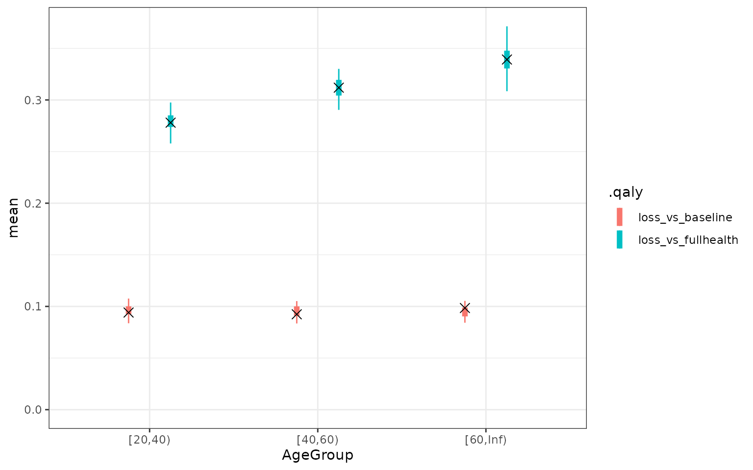
QALY values based on the model. The cross is the mean QALY based on the data. The uncertainty represents the uncertainty in the mean QALY loss according to the model
Using a Bayesian approach with the brms package
As an alternative to the bootstrap approach highlighted above, one
can also use a Bayesian approach using the brms R package.
The benefit of this approach is that the Bayesian approach takes into
account the uncertainty given the data and the bootstrap is therefore
not needed. One of the practical challenges of this approach is that
fitting the models is more computationally intensive. Consequently any
model selection exercise would also take significantly longer than using
the approach recommended by (Pullenayegum et al.
2010 Jun-Jul). Note that while the overall results of this method
are very similar to the mixed effect model above, the resulting
uncertainty in much smaller. This is a result of the different ways
uncertainty is accounted for in the models.
# uncomment and set to desired value to use multiple cores
# options(mc.cores = 12)
library(brms)

dat <- dplyr::mutate(input_dat, acute = surveyID == "survey02")

brm_model <-
    brms::brm(
        bf(.value ~ (1 + acute | respondentID) + surveyID + sex + AgeGroup + sex:AgeGroup),
        data = dat,
        family = gaussian(),
        iter = 2000,
        # Suppress messages for the article
        silent = 2,
        refresh = 0,
        open_progress = FALSE
    )

# Draw posterior samples to use in qaly calculation. We ignore the residual errors/measurement
# when calculating the QALY by using posterior_epred (instead of posterior_predict)
posterior_dat <- brms::posterior_epred(brm_model, newdata = dat, ndraws = 1000)

# For each posterior sample, calculate the qaly loss
qaly_dat <-
    purrr::map(
        seq_len(nrow(posterior_dat)),
        function(np_id) {
            dat |>
                dplyr::mutate(pvalue = posterior_dat[as.numeric(np_id), ]) |>
                qalytools::as_utility(
                    respondentID = "respondentID",
                    surveyID = "surveyID",
                    country = ".utility_country",
                    type = ".utility_type",
                    value = "pvalue"
                ) |>
                qalytools::calculate_qalys(
                    baseline_survey = "survey01",
                    time_index = "time_index"
                ) |>
                dplyr::mutate(np = as.numeric(np_id))
        }
    ) |>
    dplyr::bind_rows() |>
    dplyr::left_join(
        dat |> dplyr::select(respondentID, AgeGroup, sex) |> dplyr::distinct(),
        by = dplyr::join_by(respondentID)
    )
# For comparison, plot posterior using one posterior sample
dat0 <-
    dat |>
    dplyr::mutate(pvalue = posterior_dat[1, ]) |>
    qalytools::as_utility(
        respondentID = "respondentID",
        surveyID = "surveyID",
        country = ".utility_country",
        type = ".utility_type",
        value = "pvalue"
    )

plot_dat <-
    dat0 |>
    dplyr::rename(Actual = .value, Model = pvalue) |>
    tidyr::gather(type, value, Actual, Model)

ggplot(plot_dat) +
    geom_line(
        aes(x = surveyID, y = value, group = respondentID, colour = sex),
        alpha = 0.1
    ) +
    theme_bw() +
    theme(axis.text.x = element_text(angle = 45, vjust = 1, hjust = 1)) +
    ylab("Utility value") +
    facet_grid(. ~ type)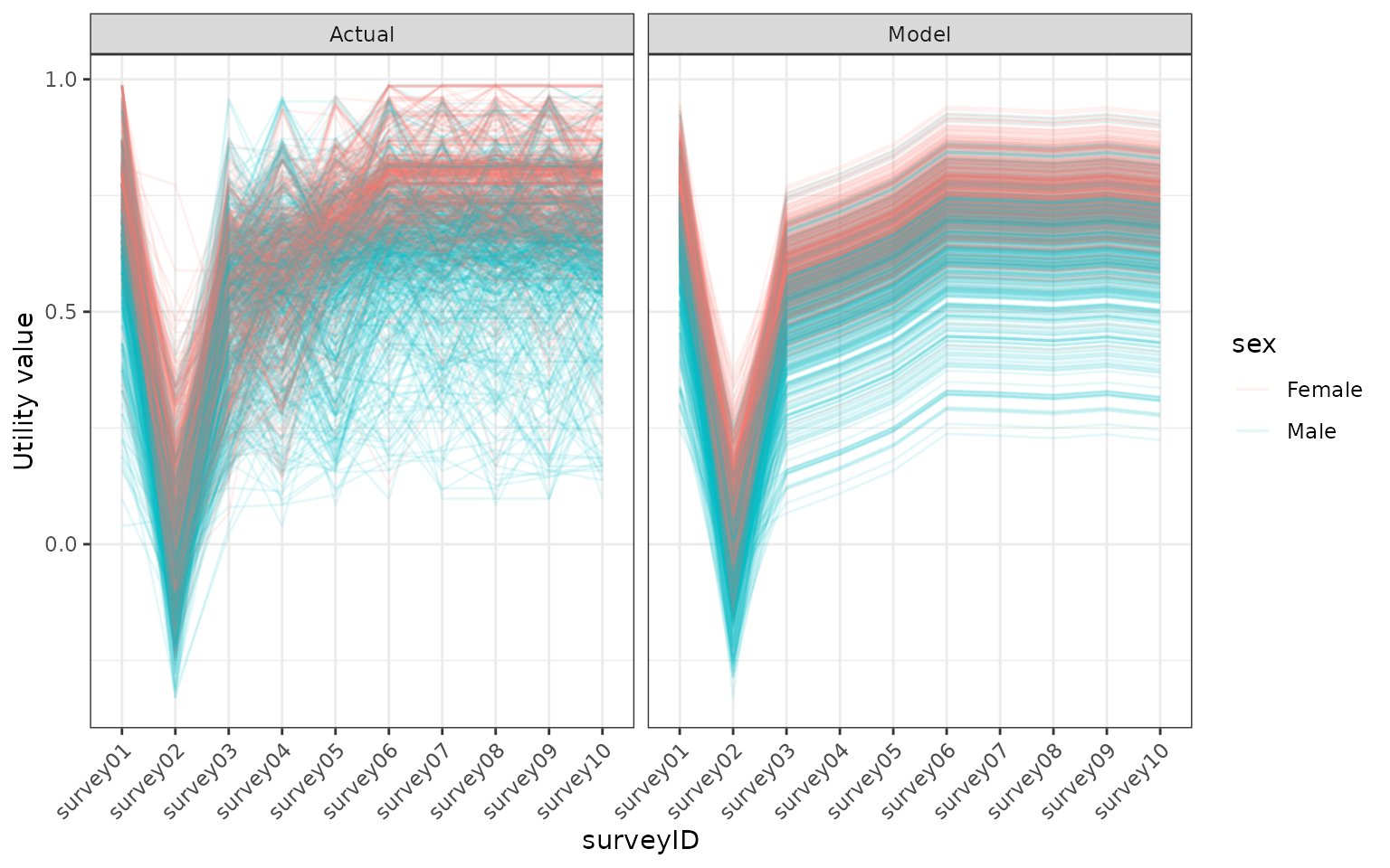
Comparing the modelled utility values, using the bayesian model, with the utility values in the model. Utility values were calculated from a EQ5D5L survey using the DSU method.
dat0 <- fixef(brm_model, probs = c(0.025, 0.25, 0.5, 0.75, 0.975))

plot_dat <-
    dat0 |>
    dplyr::as_tibble() |>
    dplyr::mutate(
        id = rownames(dat0),
        Significant = (`Q2.5` < 0 & `Q97.5` < 0) | (`Q2.5` > 0 & `Q97.5` > 0),
        # Cleanup names of the coefficients
        idname = sub("sex|surveyID", "", id)
    ) |>
    dplyr::filter(idname != "Intercept")

ggplot(data = plot_dat) +
    geom_linerange(
        aes(x = idname, ymin = `Q2.5`, ymax = `Q97.5`, colour = Significant),
        linewidth = 1
    ) +
    geom_linerange(
        aes(x = idname, ymin = `Q25`, ymax = `Q75`, colour = Significant),
        linewidth = 2
    ) +
    theme_bw() +
    theme(
        axis.text.x = element_text(angle = 45, vjust = 1, hjust = 1),
        axis.title.x = element_blank(),
        legend.position = "none"
    )
Coefficients of bayesian model. Uncertainty was captured by fitting the model to bootstrapped data. The blue colour highlights coefficients that were significant. Note that because we transformed our utility variable, the sign of these are the opposite of the previous results.
plot_dat <-
    qaly_dat |>
    dplyr::summarise(value = mean(.value), .by = c(".qaly", "AgeGroup", "np")) |>
    dplyr::reframe(
        quant = c(0.025, 0.25, 0.5, 0.75, 0.975),
        value = quantile(value, quant),
        .by = c(".qaly", "AgeGroup")
    ) |>
    tidyr::spread(quant, value) |>
    dplyr::filter(.qaly != "raw")

# Include qalys calculated from the raw data
dat0 <-
    input_dat |>
    qalytools::calculate_qalys(baseline_survey = "survey01", time_index = "time_index") |>
    dplyr::filter(.qaly != "raw") |>
    dplyr::left_join(
        dat |> dplyr::select(respondentID, AgeGroup, sex) |> dplyr::distinct(),
        by = dplyr::join_by(respondentID)
    ) |>
    dplyr::summarise(mean = mean(.value), .by = c("AgeGroup", ".qaly"))

ggplot(data = plot_dat) +
    geom_linerange(
        aes(x = AgeGroup, ymin = `0.025`, ymax = `0.975`, colour = .qaly, group = .qaly),
        position = position_dodge2(0.5)
    ) +
    geom_linerange(
        aes(x = AgeGroup, ymin = `0.25`, ymax = `0.75`, colour = .qaly, group = .qaly),
        position = position_dodge2(0.5),
        linewidth = 2
    ) +
    geom_point(
        data = dat0,
        aes(x = AgeGroup, y = mean, group = .qaly),
        position = position_dodge2(0.5),
        size = 3,
        shape = 4
    ) +
    ylab("Utility value") +
    expand_limits(y = 0) +
    theme_bw()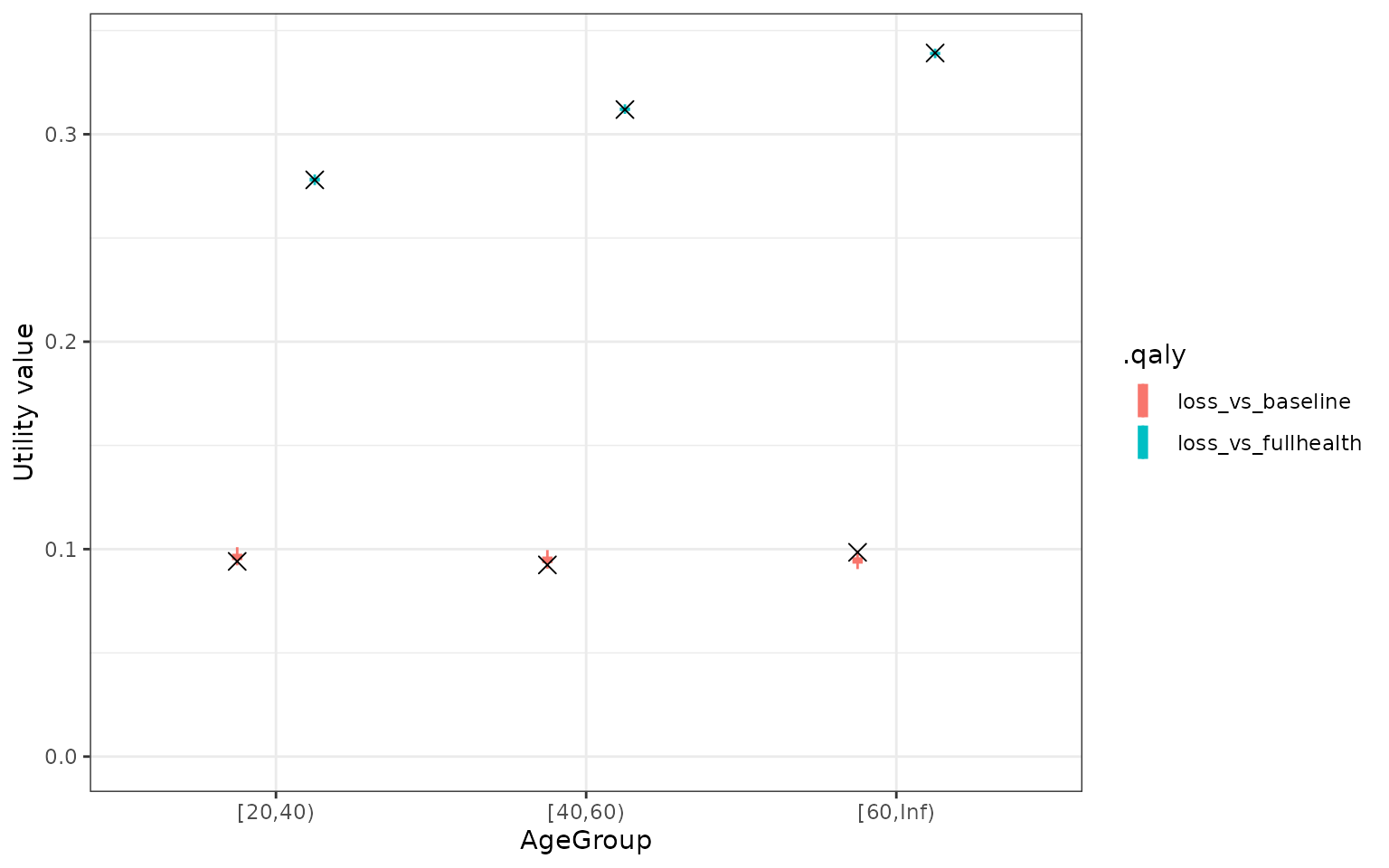
QALY values based on the bayesian model. The cross is the mean QALY based on the data. The uncertainty represents the uncertainty in the mean QALY loss according to the model